Yoga with Physio Sal
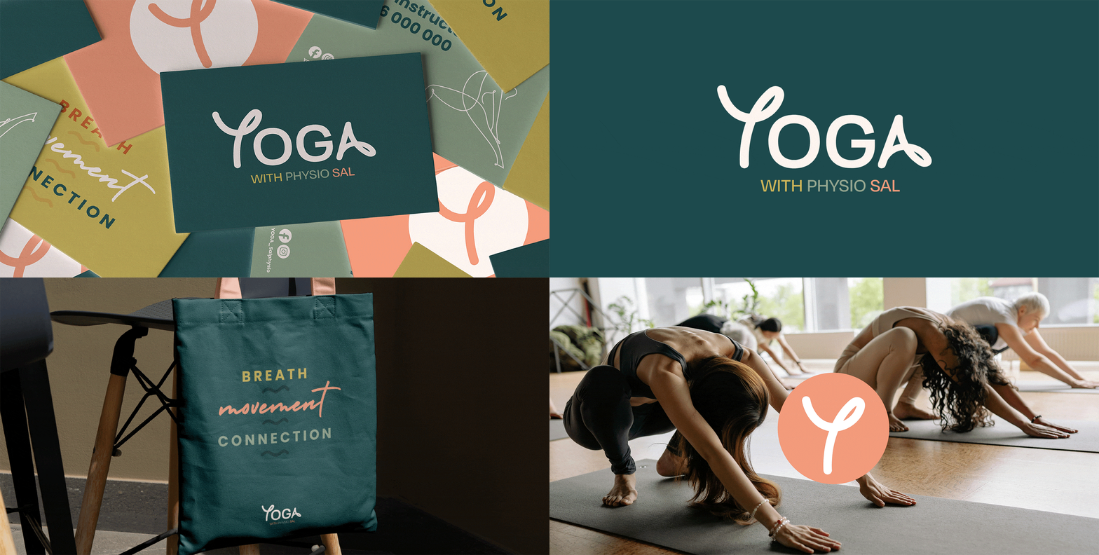
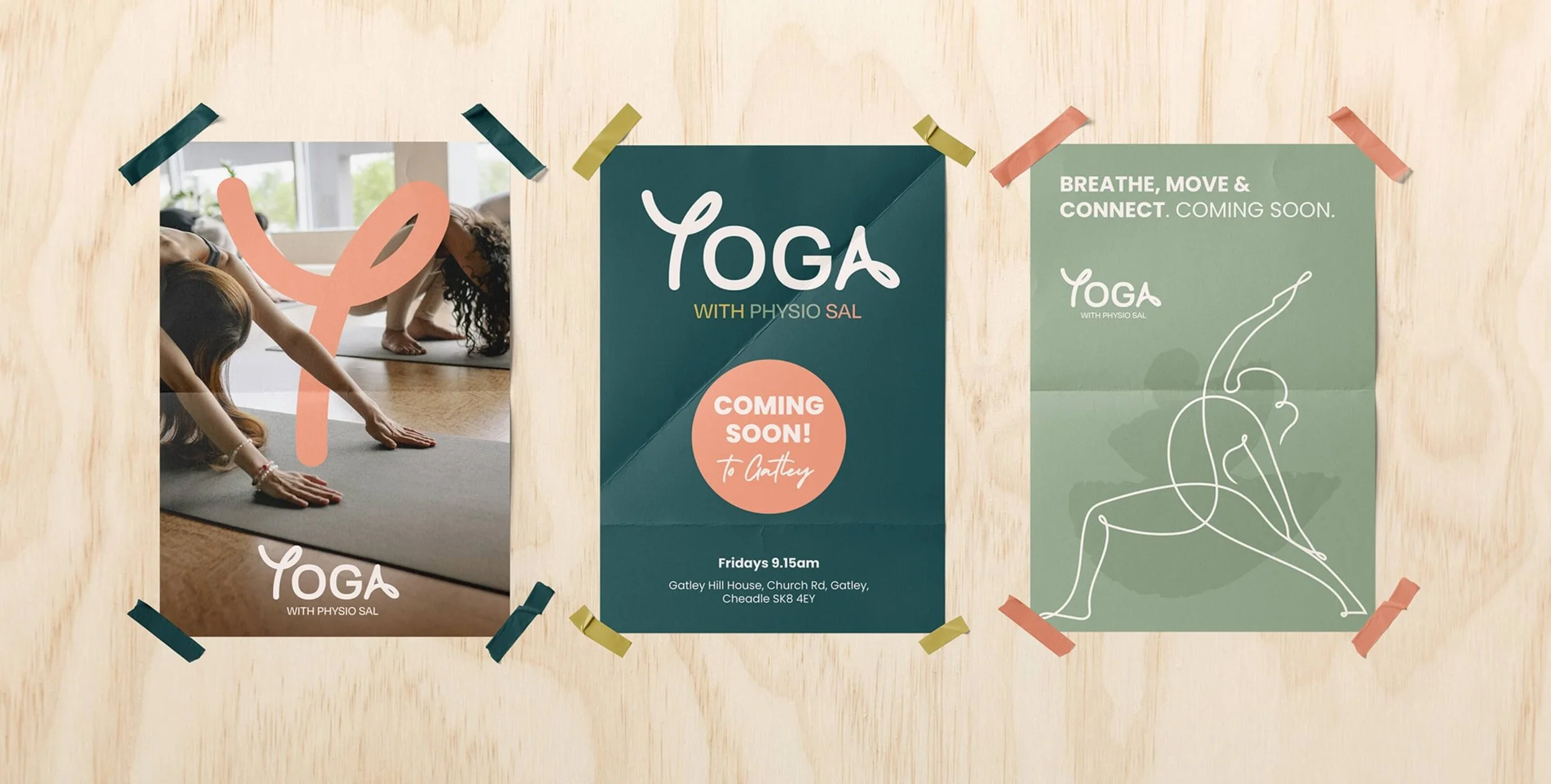
The Yoga with Physio Sal brand identity is designed to embody movement, fluidity, and a natural connection between yoga and physiotherapy. The typography reflects this philosophy, with the free-flowing ‘Y’ and ‘A’ representing movement, flexibility, and the organic flow of the body in motion. This subtle yet intentional design choice creates a sense of ease and approachability, aligning with the brand’s emphasis on mindful, physiotherapy-informed yoga practice.
What sets Yoga with Physio Sal apart is Sal’s background as a physiotherapist, giving her a deeper understanding of movement, alignment, and injury prevention. This expertise adds credibility and reassurance for those seeking a safe and supportive yoga practice. The earthy, natural color palette reflects Sal’s down-to-earth personality - free from ego, warm, and approachable - creating a space where everyone feels comfortable to explore movement and well-being in a relaxed, welcoming environment.
“It was a real treat to work with Catherine on the designs for my yoga teaching branding. I found the whole process enjoyable and Catherine’s intuitive nature and attention to detail made it easy to convey what I was looking for. Every stage of the design was timely and to our agreed schedule. I’m delighted with the completed designs and wouldn’t hesitate to recommend Catherine to anyone who wants to build their brand identity.
Sally Jones, Yoga with Physio Sal


